In this side project, I analyzed a dataset of house transactions in the Seattle area. In addition to visualizing the data, I built a regression model predicting the sales price based on other properties of the houses, such as size of the living area, the number bathrooms and bedrooms, and a rating of the house.
The underlying data are available on Kaggle. The dataset contains data of 21,613 house transactions. For each house, the price is provided along with 20 other features. I started with an exploratory data analysis, focusing on the sales price. Prices are between $75,000 and $7.7 million with a median sales price of $450,000. The exact distribution of prices is shown in the histogram below.

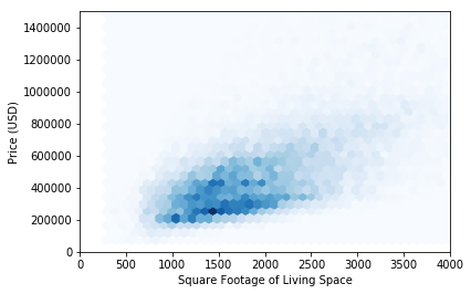
The feature most strongly correlated with price is the size of the living area. The correlation between these two features is 0.70. The relationship between these two quantities is visualized in the hexagonal binning plot below.
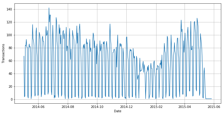
Another factor influencing sales is time. The provided data span a 12-month period in 2014/15. Throughout the year, the number of daily transactions varies based on two major cycles: a seasonal variation with a decrease in sales in the winter and an increase in sales during the summer, and a weekly cycle due to strongly decreased sales activity during the weekend (except for the first weekend in January).
In the second phase of the project, I built a predictive regression model. I started with ordinary least squares regression, which readily achieves an R2 score of 0.70. I then applied two different feature selection methods (successively adding features according to correlation with the target variable and recursive feature elimination), hoping that a subset of the features would yield the same result. While this was not the case, I learned which features had the strongest influence on model performance, particularly the size of the living area (“sqft_living”). This procedure is visualized in the plot below.

Different regression algorithms (including Ridge and Lasso regression, Support Vector Regression, Random Forest Regression) did not yield significantly better results. On other hand, adding polynomial features to the feature set improved the score to 0.82. I attempted different combinations of polynomial features, RFE, and PCA but the score didn’t improve any further.
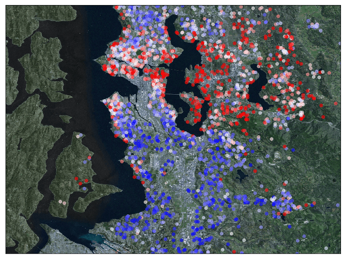
Finally, I used Basemap to visualize the house sales prices on a map. Each marker on the map below represents one sale, with the color indicating the price (red being a high price, blue being a low price). It becomes clear from this map that houses are more expensive in the downtown area of Seattle, and even more so in Redmond (east of Lake Washington). In contrast, cheaper houses are located north and south of the city, particularly around the airport. However, even in those areas, prices are increased near the waterfront.
The python code of this project is available in a jupyter notebook on GitHub and on Kaggle.

You must be logged in to post a comment.