Predicting Severity of Service Disruptions in Telstra Network

Telstra is Australia’s largest telecom provider. The company provides a dataset of service disruption events on Kaggle in which events are categorized in three levels of severity. I built a model to predict the severity of uncategorized events.

The first step of this project was to consolidate the data which was provided in separate files. I then reformatted the data to be completely numerical and checked for missing values and outliers. As several features were non-ordinal categorical features, I encoded them using one-hot encoding. The different files were linked by a common index but a given index was sometimes assigned multiple entries which I grouped together.

For model building, I started by trying out a different classification algorithms, with random forests being the best-performing one. Due to the imbalance of the different classes, I chose the F1 score as an appropriate metric and the best model achieved a score of 0.65.

In order to improve the model, I used different feature selection techniques, namely choosing features by correlation with the target, recursive feature elimination, principal component analysis, adding interaction features, and combinations thereof. However, the best model remained the original random forest model.

The python code for this project is available in a jupyter notebook on GitHub.

House Sales in King County

In this side project, I analyzed a dataset of house transactions in the Seattle area. In addition to visualizing the data, I built a regression model predicting the sales price based on other properties of the houses, such as size of the living area, the number bathrooms and bedrooms, and a rating of the house.

The underlying data are available on Kaggle. The dataset contains data of 21,613 house transactions. For each house, the price is provided along with 20 other features. I started with an exploratory data analysis, focusing on the sales price. Prices are between $75,000 and $7.7 million with a median sales price of $450,000. The exact distribution of prices is shown in the histogram below.

img-price-histogram

The feature most strongly correlated with price is the size of the living area. The correlation between these two features is 0.70.  The relationship between these two quantities is visualized in the hexagonal binning plot below.

img-price-sqft

Another factor influencing sales is time. The provided data span a 12-month period in 2014/15. Throughout the year, the number of daily transactions varies based on two major cycles: a seasonal variation with a decrease in sales in the winter and an increase in sales during the summer, and a weekly cycle due to strongly decreased sales activity during the weekend (except for the first weekend in January).

img-prices-year

In the second phase of the project, I built a predictive regression model. I started with ordinary least squares regression, which readily achieves an R2 score of 0.70. I then applied two different feature selection methods (successively adding features according to correlation with the target variable and recursive feature elimination), hoping that a subset of the features would yield the same result. While this was not the case, I learned which features had the strongest influence on model performance, particularly the size of the living area (“sqft_living”). This procedure is visualized in the plot below.

img-correlation

Different regression algorithms (including Ridge and Lasso regression, Support Vector Regression, Random Forest Regression) did not yield significantly better results. On other hand, adding polynomial features to the feature set improved the score to 0.82. I attempted different combinations of polynomial features, RFE, and PCA but the score didn’t improve any further.

Finally, I used Basemap to visualize the house sales prices on a map. Each marker on the map below represents one sale, with the color indicating the price (red being a high price, blue being a low price). It becomes clear from this map that houses are more expensive in the downtown area of Seattle, and even more so in Redmond (east of Lake Washington). In contrast, cheaper houses are located north and south of the city, particularly around the airport. However, even in those areas, prices are increased near the waterfront.

img-map

The python code of this project is available in a jupyter notebook on GitHub and on Kaggle.

Data Science Workshop

I recently participated in a three-week workshop by UC Berkeley’s Graduate Data Science Organization (GDSO). Together with three other team members, I analyzed a data set of ceramics materials. We developed a model that predicts certain properties (density, fracture toughness, etc.) of an unknown material.

gdso-0Determining the properties of a new material through experimentation and rigorous theoretical calculations is time-consuming and costly. This is particularly challenging when a large number of candidate materials needs to be assessed regarding their suitability for a specific application. However, by using machine learning, material properties can be inferred in a more efficient manner. The results can be used to quickly select a smaller subset of the candidate materials which can then be investigated with experiments and calculations.

We used a data set containing over 4,000 materials from the NIST Structural Ceramics Database. This dataset contains a large number of features but only a few features are available for any given entry. Our first challenge thus was to consolidate entries. We then standardized the features, removed outliers, eliminated anomalous entries, and selected the most relevant features. We also included additional features using the matminer package.

gdso-1We then used linear regression and random forest regression to predict key physical properties. While linear regression strongly overfit the data, random forest regression gave a more accurate prediction.

I thought this workshop was a productive exercise, not only in applying different machine learning algorithms, but also because we worked with a real-world materials data set that required a good amount of preparation and cleaning. I also liked that I got some practical experience in developing a script in a team environment using git. This was a valuable experience because so far I’ve mostly developed code on my own.

You can find the GitHub repository of this project here.

Classifying Wine

In this project, I used a series of classification algorithms to assign wine to one of three categories based on their chemical composition.

The dataset contains 178 different wines from the same region which belong to three different cultivars. Each of the 178 wines is characterized by 13 numerical features which correspond to different chemical constituents. In order to be able to visualize the data and the classification models, I reduced the dimensionality of the features from 13 to 2 using principal component analysis (PCA) which preserved 56% of the variance information. Below is a visualization of different wines (each wine is one data point) in this reduced two-dimensional feature space.

Screen Shot 2018-07-10 at 8.33.05 PM

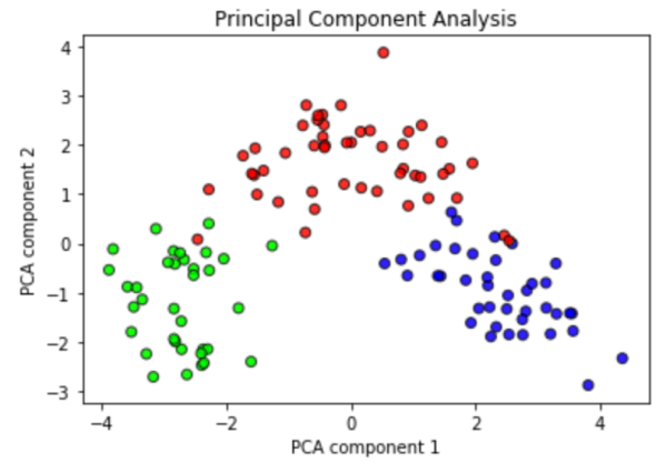
The three different wine cultivars (classes) are represented by three colors. This diagram demonstrates that even after performing PCA, the three classes are well-separated, with only a few samples lying in another classes’ domain.

Next, I trained six different classification algorithms implemented in the scikit-learn module on these data: perceptron, logistic regression, kernel support vector machines (SVM), decision trees, random forests, and k-nearest neighbors (kNN).

Before doing so, however, I split the data so that 70% of the samples (wines) would constitute the training dataset and held back the remaining 30% as the test dataset. The training set is used to build a model describing the data, and the test set is used to verify that the model is capable of predicting the category (class) of unknown data. The two datasets are shown in the two plots below (training set on the left, test set on the right).

0-lr-both

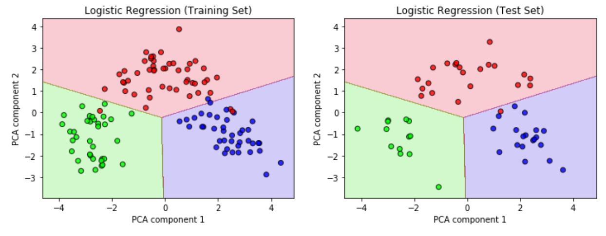
However, the above plots not only show the two datasets (the data points) but also a background of varying color. This background represents the classification model, in this case using the logistic regression algorithm, which was built using only the training set on the left: in areas with a red background, the model predicts that any wine sample lying in this area will belong to the ‘red’ class (as opposed to the other two, the ‘green’ and ‘purple’ wines).

The logistic regression model is then used to predict the class (red vs. green vs. purple) of the test set, which is not ‘known’ to the model and the class labels of which are not fed to the model. Nevertheless it is able to predict the class of the 54 test samples with a great accuracy of 98%.

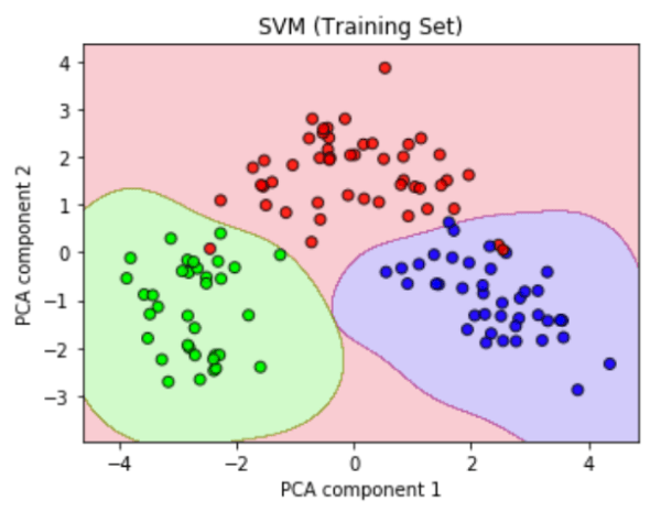
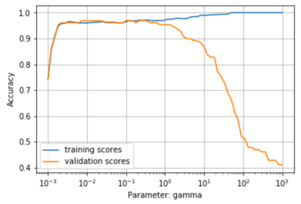
While the logistic regression model partitions the feature space by linear boundaries, there are also non-linear models such as the kernel support vector machines (SVM) algorithm. The left plot below shows the same training set as before but it is now overlaid with the predictions of the SVM model. The exact shape of the green and purple domains is determined largely by a hyperparameter named gamma. I used the validation curve shown on the right to determine the optimal value for gamma, which is the value at which the accuracy of the validation score (orange) is maximized.

2-svm3-svm valid

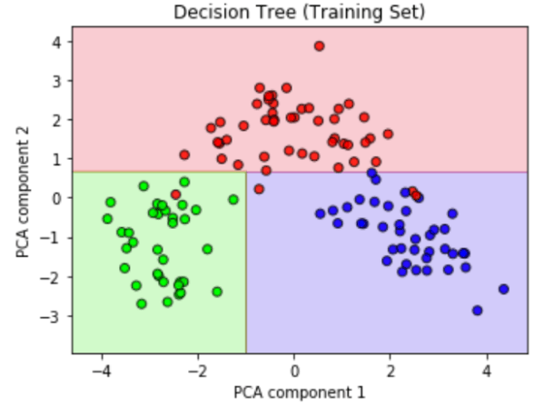
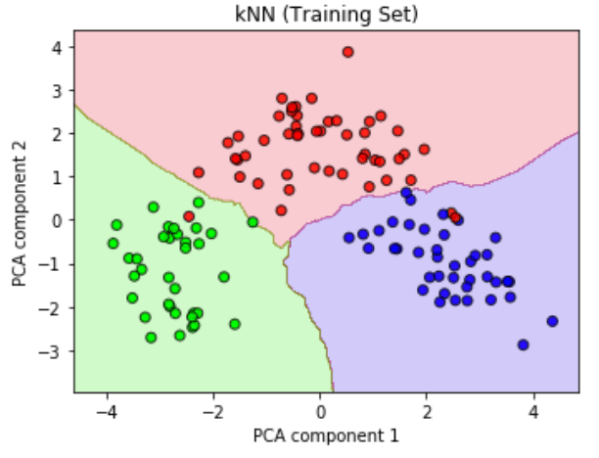
In a similar fashion, I also trained the remaining models on the data. The two following diagrams show the training data with a decision tree model (left) and a k-nearest neighbor model (kNN, right). I evaluated each algorithm through the accuracy of it’s class predictions for the test set and the their respective time required to be trained. As it turns out, the k-nearest neighbors model performed best on this dataset.

4-trees5-knn

The python code of this project is available in a jupyter notebook on GitHub.

New York City Subway Data

New York City’s subway system is run by the Metropolitan Transportation Authority (MTA). On its website, the MTA publishes data sets containing information about entries and exits through the various turnstiles at each of its stations. Each turnstile has a counter for entries and one for exits which continuously count the number of riders passing through.

Using python in a jupyter notebook, I analyzed these data to learn what the busiest stations are, which stations people commute to and from, what times of the day are the busiest, and how the ridership changes on weekends and over the course of a year. Finally, I developed a simple model that predicts the ridership on any given day. The complete jupyter notebook is available on github.

The first thing I looked at was the overall ridership for each station (entries plus exits). The map below shows the busiest subway stops as circular markers whose size corresponds to the passenger volume. Most of them are located in Manhattan, and particularly in Midtown. The busiest station is 34th St/Penn Station. I created the map using matplotlib‘s Basemap.

mta-6

By looking at the ridership data in the morning and in the evening, I was able to determine which stations people commute from (origins) and which stations they commute to (destinations). If more passengers enter a given station in the morning than in the evening and more passengers exits this station in the evening than in the morning, I can classify it as a commuter origin.

In the following map, blue stations are commuter origins, red stations are commuter destinations. The size of each circle indicates the morning–evening difference in ridership. Clearly, there is a high density of commuter destinations in Manhattan. The commuter origins (blue) are located mostly in the Bronx and the peripheral parts of Queens and Brooklyn.

mta-1

Next, I was interested in the ridership distribution over the course of a day. The histogram below shows the ridership for different parts of the day, distinguishing between weekdays (blue) and weekends (brown). There are generally more riders on weekdays indicating that a large amount of passengers commute to work or school. In addition, the weekend distribution looks different: there are less early-morning trips betwen 4am and 8am, but more late-night trips between midnight and 4am.

The green histogram at the bottom makes this clearer by showing the changes in ridership on the weekend, compared to a weekday.

mta-2

It’s also interesting to compare the ridership distribution over the course of a day for different stations. For example, the below histogram compares the 183 St. station in the Bronx and the Bedford Avenue station in Williamsburg to the average New York ridership. While passengers in the Bronx use the subway disproportionately in the early morning hours (4-8am) and much less between 4pm and 8pm in the evening, the commute hours in Williamsburg seem to be shifted to later times: there are less trips at the normal commute hours (4-8am and 4-8pm) and more trips between 8am-noon and 8pm-midnight.

mta-3

Finally, I looked at the total daily ridership over the course of a year. As you can see in the plot below, ridership oscillates due to the decreased number of trips on weekends. Additionally, there is a decrease in weekday ridership between July and September (presumably due to closed schools) and a strong dip around the winter holidays. There are also little spikes where ridership drops sharply to weekend levels in the middle of the week, which are due to major holidays (see for example the dip on July 4th).

mta-4

I used a linear regression model to predict the daily ridership. The features it is based on are the day of the week, a calendar of school days, a list of national holidays, and key weather metrics such as the average temperature, precipitation and snow depth. Although the model has quantitative deficiencies, it captures the general trends in the data, including the anomalous behavior during the holiday season.

The jupyter notebook of this project is available on GitHub.