In this project, I’m developing a python program that evaluates GPS data collected with the Runkeeper app during my runs, extracts some metrics (e.g. total distance, average pace) and visualizes the run in an elevation profile, pace over time and on a map. It also allows a comparison of multiple runs.
Each run is represented by a gpx file containing a series of waypoints. The data are loaded into a pandas DataFrame using the gpxpy module. The program extracts the total distance, total time, average pace, and total climb of the run. Using matplotlib it visualizes the data in the form of elevation profile and a chart of pace over distance:


Due to the noise level of the pace data (which are determined from waypoints spaced only a few seconds (shown in gray)), the pace-over-distance chart was smoothed with a rolling average (red). The blue line indicates the average pace.
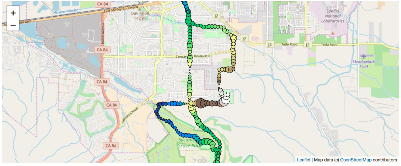
Next, using the ipyleaflet module, the run is visualized on a map. The waypoints in this map not only convey the path but also the current elevation (through their color code) and the current pace (larger markers represent a slower pace). This visualization allows us to draw the unsurprising conclusion that I got slower when running uphill and faster when running downhill.
Additionally, the program can read multiple gpx files containing one run each. It allows a comparison of different runs, gives an overview of the longest and fastest runs, and prepares visualizations such as this histogram describing how often a given distance was run. Apparently, most runs are just over 6 miles.

The jupyter notebook for this python project can be found on my GitHub profile.

You must be logged in to post a comment.